
You’re here because you want to learn more about sales funnels.
Well you won’t be disappointed. I promise.
This is currently the most comprehensive resource you can find about sales funnels. I originally wrote it back in 2011. Back then, there was very little, if any, published information on the topic.
Like the gift that keeps on giving, the following is brand-new and updated for 2018. We’ll continue to add to this post in the future, too. I recommend bookmarking it.
We have 17 ripe examples here of some of the best, highest-converting funnels on the web today. From huge companies like Groupon and Netflix to smaller brands like Crazy Egg and Mixergy, these examples cover all bases.
What Is a Sales Funnel?
Before we dive into this list, we should briefly discuss some terms. We’ve defined sales funnels before, and even offer a handy template, but let’s review what it is:
A sales funnel is “a series of steps designed to guide visitors toward a buying decision. The steps are composed of marketing assets that do the work of selling, like landing pages and email.”
Want to jump ahead? Here’s a handy table of contents (and don’t miss the bonus at the end):
- Example 1 – CrazyEgg.com
- Example 2 – Groupon.com’s sales funnel
- Example 3 – Grasshopper.com
- Example 4 – Basecamp
- Example 5 – Mixergy.com
- Example 6 – Planscope.io
- Example 7 – AutoGrow
- Example 8 – Harvest
- Example 9 – Perfect Audience
- Example 10 – Leadpages.net
- Example 11 – HelpScout.com
- Example 12 – Drift
- Example 13 – Mint
- Example 14 – Wufoo
- Example 15 – MailChimp
- Example 16 – SEOMoz
- Example 17 – Netflix
If you like sales funnel examples like those in this indepth article, then you’ll also like my free 11-point checklist for how to create the perfect sales funnel.
Here’s the format for how I’ve broken down each example:
Steps in Sales Funnel – This lays out for you, point-by-point, each page and step the customer goes through on their way to making a purchase. In some cases, it also works to point out some of the follow-up steps and “if-then” scenarios. For instance, how does the funnel respond “intelligently” to get prospects who didn’t buy to come back to the website?
Why It Works – In this section, I break down for you why the funnel works and what natural logic or emotional “hooks” it uses to drive conversions.
What Makes It Unique – You get the idea.
Where it Could Be Better – Here I give my professional opinion of what could be improved and why certain parts of the funnel might be leaking.
EXAMPLE 1 – CRAZYEGG.COM

Crazy Egg’s sales funnel is huge. They have an excellent blog with high-quality content. Their sales funnel actually starts at their blog. That means most of their traffic is coming from inbound sources like Google.
They have a clear call to action (CTA) at the bottom of their blog posts to drive customers onto their email list.
There’s also a direct CTA for Crazy Egg’s product that slides into view as you scroll down about seventy percent into the post.
Steps in Sales Funnel

1. Traffic (from referrals, organic, blog, and ads)
Crazy Egg has a pop-up at the bottom of their blog posts for a free 30-day trial.
If you sign up for the email list, you will be brought back to Crazy Egg’s homepage.
They also link directly to Crazy Egg at the top of every page.
2. Homepage (email and password required for next step)
3. Pricing

4. Checkout form

The pricing page has a similar aesthetic to the rest of the site. It’s very simple and has been like this for over a year now. Crazy Egg offers free trials. The pricing page has light copy, with emphasis on social proof. The language is simple, no jargon.
After you select your pricing plan, the final step is to add billing information. Crazy Egg assures you on the checkout page that you won’t be charged within the first 30 days.
Why It Works
According to Neil Patel, whom I interviewed a couple of years ago, Crazy Egg has consistently doubled its conversions and revenue year over year.
The focus of the funnel’s design is on simplicity. There’s not a lot of copy. Instead, there’s a focus on strong visuals.
Those visuals are one of the things that really stands out for me about Crazy Egg now compared to how it was. In the past, it was much more heavy on the copy and in explaining the benefits of the service.
What Makes It Unique

Instead of bombarding the customer with information, Crazy Egg keeps the info light. However, the copy is clear and confident so customers know what they’re getting before they submit their email address.
Where it Could Be Better
When I first wrote this article in 2011, I mentioned how the marketing copy for Crazy Egg’s heat-mapping feature could have been stronger by better explaining how the tool helps customers to increase conversions. While this information is clearer now thanks to the detailed visuals and simple copy layout that allows the reader to skim and scan — it could be better by explaining a bit more.
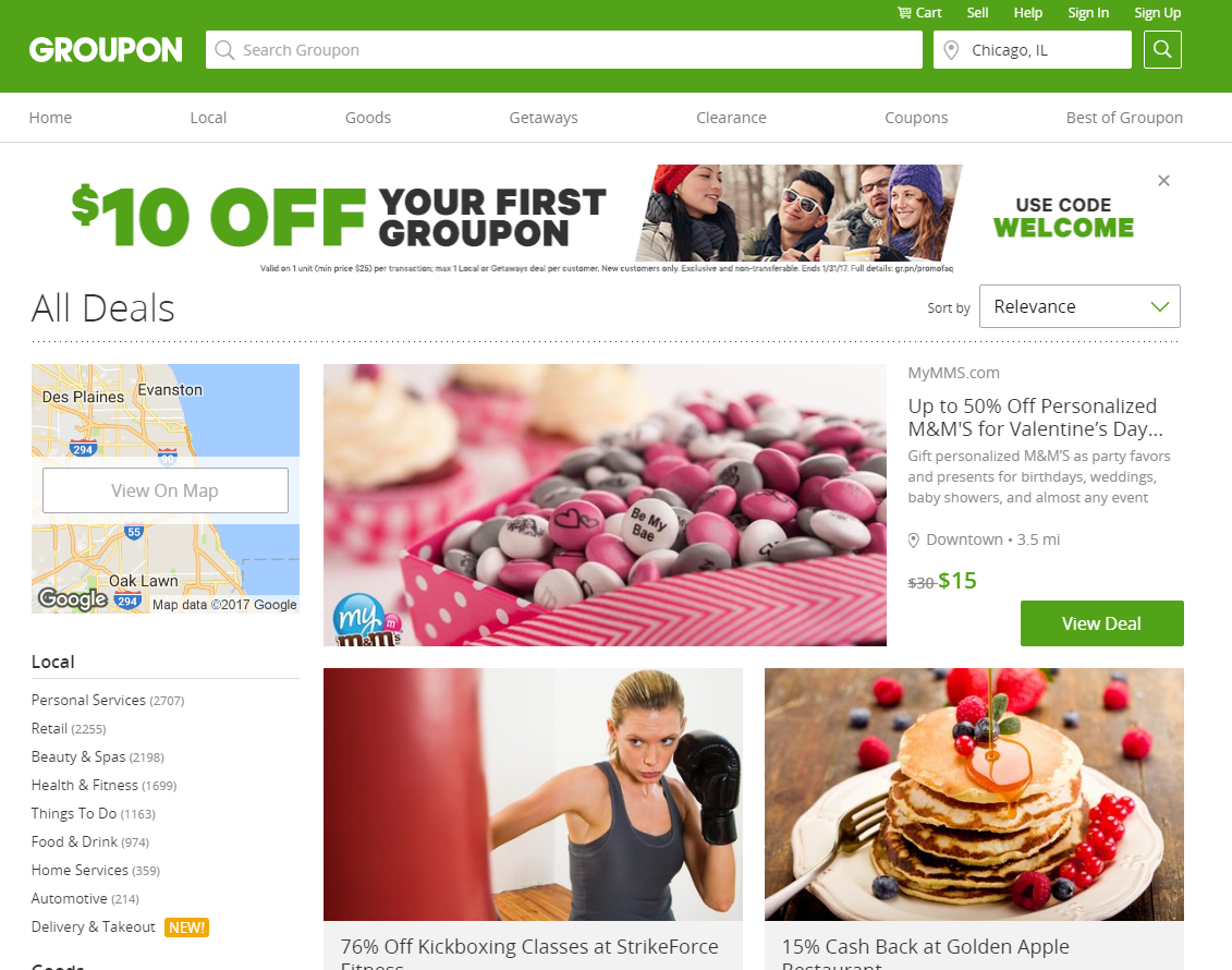
EXAMPLE 2 – GROUPON.COM

Groupon may not be a hot, new concept anymore, but, they’re still a major company reaching millions of consumers every month.
They have a very clear email opt-in pop-up on their site. It’s similar to what they used to have on their homepage but now it’s showing to all visitors across the site on their first visit.
It focuses your attention and has clearly been a successful strategy for growing their audience since they have continued to use it over the years. Let’s examine the rest of their sales funnel to see how it works.
Steps in Sales Funnel
- Traffic (from ads, direct, referrals, affiliates, email list, and more)
- Homepage
- The pop-up on the homepage incentivizes you to give your email address. You get a coupon code for $10 off $25 on your first order just for signing up.
- From there, you can browse and shop for services.
- Internal homepage view offer details
- Purchase form
Why it Works
When you find a deal you like on Groupon, there’s a clear CTA to get you to click. You do need to sign up through email, though. Groupon’s follow-up offers are then tailored to its customers to get them to use the service again.
Groupon sends out a daily email blast to its millions of subscribers across thousands of locations where it has deals. Groupon’s offers are slightly more tailored toward women because they make up a majority of its customer base.
What Makes it Unique
As an email-driven service, Groupon sticks to its guns. You can’t even preview offers and services until you sign up. There are no free trials. Customers either want in or they don’t.
Groupon’s business model and sales funnel is, in a way, best thought of as a giant email list which happens to have a website attached to it.
Where it Could Be Better
After signing up for Groupon, you’re kind of left in the dark about what to do next. You don’t know if you’re looking in the right place. You’re not sure where to search by location (it’s in the upper right hand corner, by the way). The user experience is a bit confusing and can turn customers away.
If you like these funnel examples, and want to take it to the next level, check out our Sales Funnel Diagram Pack (w/ strategy videos). It’s awesome, nothing like it on the web.
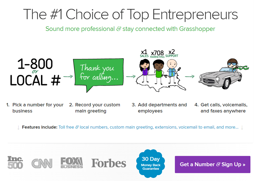
EXAMPLE 3 – GRASSHOPPER

Grasshopper hasn’t changed much since I covered them last. But that’s not a bad thing. When I originally wrote about them, I mentioned how they brought in at least $60 million annually. These guys have marketing prowess.
Let’s dig back into their sales funnel again, shall we?
Steps in Sales Funnel
- Traffic (from PR, blog, and ads)
- Homepage
The copy has small changes but the meaning is the same. They still offer the same 30-day money-back guarantee. Their services are explained in an inviting, 2-minute YouTube video and also clearly listed in bullet points.
3. How it Works & Features
The How it Works & Features page explains Grasshopper’s services in depth. They also repeat the video from the homepage. There are CTA buttons at the top and bottom of the page. You can’t miss these.
4. Pricing Page

Grasshopper’s pricing page hasn’t really changed.
5. Sign-up Form

First, you have to choose a phone number to register with Grasshopper. You can get a local number and a toll-free number. The next page gives that number text message access. Finally, you’re brought to the billing page. This, too, hasn’t changed at all.
Why it Works
In my original post, I mentioned all the design changes, color combinations, and other elements Grasshopper tested and improved. They even cut down on their sales funnel so it converted better.
What they’re doing is clearly working. Even years later they haven’t changed their site much.
What Makes it Unique
Grasshopper’s logo and brand character (a grasshopper, of course) are still worth noting. Their product is easy to use. They continue to stick with a design that speaks to the simplicity of the product.
Where it Could Be Better
My earlier complaints still stand. Grasshopper could still appeal to its audience better. I still think it should pose a question like How many customers are you missing out on because you don’t have a professional phone number and phone system connected to your business?
I also maintain that they need to elaborate on their 30-day money-back guarantee. They should explain it up-front so there are no surprises later.
EXAMPLE 4 – BASECAMP.COM

Unlike Grasshopper, Basecamp has changed a lot since I last wrote. They continually test new designs. Their homepage is always changing. They show a lot of social proof. There’s a lot of focus on problems they can solve. They’re very visual. They use a lot of cartoons and drawings.

Basecamp also feels very personal. Users share their names in testimonials, further emphasizing social proof; however, these are presented in a unique way.
Steps in Sales Funnel
- Traffic (blog, PR, organic search)
- Homepage
The current version of Basecamp is in testing stages, but as mentioned, it’s impressive. In addition to the social proof, attention-grabbing cartoons, and testimonials, they emphasize showing you the product in action. They put a face on their logo for an emotional tie-in. There are use cases and tons of benefits.
3. 30-day free trial sign-up

As mentioned, Basecamp is free to try. You don’t have to fill in your credit card information initially when you sign up. They keep their pricing info super simple.
Thank you page (not so important, but worth noting)

Why It Works
If you thought Basecamp had a lot of social proof before, its new design emphasizes it more than ever. They’re really promoting how it’s free to sign up. Who doesn’t love free stuff?
What Makes It Unique
Every company wants to solve problems for their customers. Basecamp takes it above and beyond. They give it the same significance as their customers. That speaks to customers on a very natural, real, level.
Where it Could Be Better
I didn’t have much criticism for Basecamp before, and I still don’t. I maintain that pictures of real people might make the user experience even more personal. That’s my only improvement, though.
EXAMPLE 5 – MIXERGY.COM

Mixergy sells interviews and courses featuring top entrepreneurs. Their funnel starts right away with a CTA offering access to interviews in exchange for an email address. You can then add your information and get an email link for a video.
Now Mixergy has your contact information. They can message you and try to move you into their premium section.
Steps in Sales Funnel
- Traffic (email list, organic, social media, referrals)
You might find Mixergy through Google or you might come to the site and just browse around. - Homepage
The homepage has multiple CTAs. Mixergy promotes its risk-free guarantee here, too.
3. Content List (Blog-Roll Page)

4. Premium Content (shows that some content is restricted to members only)
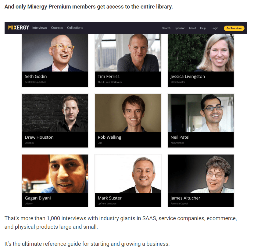
This is where each interview and course preview is listed.
5. Pricing Page

There are two pricing options: one for a monthly membership and one for an annual membership. You get to the checkout form in just one click.
Pop-up Payment Form

Why It Works
Mixergy works because they’re getting contact information. They’re giving you access to all of their content, but they’re charging you for it. There are areas of the site only members can access. There’s a little bit of mental friction there.
If you try to opt-in with the same information to get another video, they ask you to sign up again. I believe that is their process. Like I said, that creates some friction. Yes, you can enter a fake email, but, if you believe in the quality of the content (and it is really good content; Andrew is one of the best interviewers on the Internet), you won’t.
What Makes it Unique
Andrew Warner is like the Napoleon Hill of our time. He is excellent at interviewing entrepreneurs and helping them tell their story in his interviews.
Where it Could Be Better
Like I’ve said before, beef up the security logos and add more credit card fields. The payment form still needs some touching up. I also think Mixergy could appeal to a bigger audience with different pricing packages.
Like sales funnel examples like this? Then you’ll love our free, action-packed newsletterthat gives you bit-sized tips for growing your sales.
EXAMPLE 6 – PLANSCOPE.IO

Brennan Dunn might not personally manage Planscope anymore, but he’s still involved in the company in some capacity. As you may know, he’s a buddy of mine. The site is quite straightforward. It looks a lot different than it did the last time we covered it. Let’s see how that’s changed the sales funnel.
Steps in Sales Funnel
- Traffic (email newsletter and blog)
- Homepage (instant sign-up)
The homepage is nicely designed. You can see what the software looks like right on the page.
3. Dashboard Tour
This is an internal set of pages that gives the user a personalized, guided tour of how the product actually works.
4. Pricing Page
The pricing table is super simple. There are four different tiers: freelancer, small team, consultancy, and agency. You get a 14-day free trial for the tier of your choice.
Why it Works
Part of what Brennan told me is that Planscope works because they require a credit card. There are no tire-kickers. People who sign up are highly qualified.
What Makes it Unique
I maintain that Brennan’s welcome video is quite unique. It’s instructional and helpful. His invitation to talk on Skype does not go unnoticed. This personal touch is a great way to end Planscope’s sales funnel.
Where it Could Be Better
Compared to the rest of the site, the support page (Planscope Knowledge Base) is a little lackluster. It could use a design makeover like the rest of the site.
EXAMPLE 7 – AUTOGROW

I’d be remiss not to include AutoGrow on this updated list. I post all the time about how to grow and improve your sales funnel, but have you ever wondered what my company’s funnel is like?
It’s time to find out.
Steps in Sales Funnel
- Traffic (organic and referrals from autogrow.co blog)
- Homepage (with email sign-up required for next step)

Our newsletters, blog, and multi-day courses all lead back to our homepage. At that point, you go from the homepage to the pricing page.
3. Pricing Page
Many customers like to watch our demo before they check out. They’ll often sign up after seeing our demo.
Why it Works
We consider ourselves to be very clear in all we do. We’re selling a higher-priced monthly service.
If you like these funnel examples, and want to take it to the next level, check out our Sales Funnel Diagram Pack (w/ strategy videos). It’s awesome, nothing like it on the web.
EXAMPLE 8 – HARVEST

Harvest hasn’t changed its sales funnel much since last time I covered. It still offers a 30-day free trial. They do get traffic from their blog, but a lot of traffic is probably from referrals, too. They’re pretty popular. We’re still a customer.
Steps in Sales Funnel
- Homepage
Harvest hasn’t changed their homepage since we last updated this post, and that’s okay. It has several clear CTAs across the page. There are clear product explanations and even a few testimonials. There’s high social value.
2. Free Trial Sign-up

3. Free trial ends, offer / reminder to sign-up
Why it Works
With the same design as before, I still appreciate Harvest’s ease of use and straightforwardness.
What Makes it Unique

We mentioned before about how Harvest “locks in” customers. That’s still the case, I believe.
While that is unique, Harvest also offers detailed testimonials that are worth mentioning. These are real case studies of Harvest in action. These companies get some free publicity and help Harvest look better.
Where it Could Be Better
I think Harvest could stand to improve its pricing page. You actually pay more by adding more users or by upgrading your plan to access new features. I would recommend they pick one metric. Otherwise it’s too many things to think about. Simplifying the pricing would help their conversion rate.
EXAMPLE 9 – PERFECT AUDIENCE

Perfect Audience has tweaked its design somewhat since we last wrote. Their pricing page is rather hidden, though. Let’s check out their sales funnel to learn more.
Steps in Sales Funnel
- Homepage (retargeted banner ad)
- If you’ve visited their website in the past, you’ll be retargeted and encouraged to come back to the site to complete your registration.
- Free Trial Sign-up Page

Customers who sign up get a 14-day free trial. However, the terms of the free trial, including what customers can do with the software, is not clear.
Emails (“nudge” emails sent post-sign-up to help you get set up)
Why it Works
Overall, the design is pretty nice. They still have lots of social proof. They have a good CTA that appears twice on the homepage.

What Makes it Unique
I mentioned the color scheme last time and how it stood out to me. Although Perfect Audience has changed the look of its site since then, it still has that same color scheme. It’s simple, but the white, blue, and gray background is appealing.
Where it Could Be Better
As I said before, their pricing page is buried. You have to search under the platform tab to get there. Customers are always wondering how much a service costs. They need to get some sort of idea of the price. Perfect Audience needs to be clearer about that.
Also, regarding the design of their icons, they all look like they’re from a different designer. It would be better if these looked cohesive.
Ready to create your sales funnel? Don’t do it without our 11-Point Perfect Sales Funnel Checklist.
EXAMPLE 10 – LEADPAGES.NET

Leadpages has redesigned their website a couple of times since I originally wrote about their sales funnel. As a landing page builder, they’re showing you the product right upfront. They let the product be the star. I’ve seen MailChimp do something similar.
You can demo the product right on the page in a 90-second video. They’re showing you how the product works and how easy it is to use. You can almost see yourself on the page.
Leadpages effectively uses live webinars to drive customer sign-ups.
They also have a very popular blog, which is where their sales funnel starts.
Steps in Sales Funnel
- Email list or blog page
- Homepage
Leadpages’ CTA is found across their entire website. There’s another more detailed demo to teach customers more. However, you must have a login to view it. After going through the features on the homepage, you’re taken right to the signup page.
3. Pricing Page

The pricing page is pretty clear. The features presentation feels a little complex. I like the idea that they have a pricing video. There’s a lot of emphasis on social proof. They show you the price at checkout. The credit card info is all in one convenient place.
4. Purchase Page
Why it Works
As I mentioned, Leadpages is big on social proof. They have company team members right in their videos. That sends the message that they’re legit. Their site is high quality, too.
What Makes it Unique
Again, a video discussing pricing is pretty interesting. Some sites keep their pricing vague, so a video explainer is helpful. Seeing a real member of Leadpages go over the pricing might connect better with customers.
Also, they put a heavy emphasis in their funnel for annual signups. There are steep discounts offered if you sign up for the whole year instead of just monthly.
Live webinars are a unique draw. Once Leadpages has attendees’ email addresses, they can make special offers to key prospects.
Where it Could Be Better
Something about it feels very salesy (in an affiliate marketing kind of way), and I like it less for that reason.
To put it another way, I don’t care about being pitched to buy something but something about the funnel doesn’t feel authentic. For example, on the purchase page, the signup form feels unreasonably long, and there’s a lot more text there than is necessary (or typical). It almost feels like I’m signing a contract, even though I know I’m not.
Similarly, some of the blog articles, though educational and really informative (thank you for sharing your knowledge!) brand LeadPages in a negative light with article titles like “Use this new (sneaky but ethical) tactic.” I feel like by signing up for their software, I’m almost going to unfairly manipulate my customers.
Last, I believe the 30-day money-back guarantee could also be better emphasized to help lower perceived risk.

One concern I have is that when you get to the checkout page, you almost feel like you’re on a different website. It still says Leadpages, but the layout has changed. This is something that we’ve gotten feedback on and criticism from users on our own site.
If the layout changes and makes you feel like you’re on a different site, it can feel scammy, like you’ve been taken off the website. Now you’re not sure where you’re putting your information. Is it some other site or third party?
People are worried about that stuff, and rightfully so.
EXAMPLE 11 – HELPSCOUT.COM

Help Scout has changed a lot since the last time we covered them. I actually love their redesign. They offer a demo (they’re actually testing a shorter version). I love the little designs and animations. It feels kind of emotional. It’s cute.
The site has good contrast; it’s easy to read. There’s nothing interfering with the copy. There’s no messy background. There’s a good CTA and lots of social proof. It may be below the fold, but it’s still high up enough that it’s easy to see.
Let’s dive right in to Help Scout’s sales funnel.
Steps in Sales Funnel
- Traffic (blog or resources page)
- Homepage
As I’ve said, Help Scout’s homepage is clean, cute, and has great contrast. There’s plenty of social proof and a clear CTA.
3. Pricing Page
Help Scout doesn’t ask about pricing. They just bring you right to the signup page. There are three pricing tiers: free (for a shared inbox), standard (with automation and reporting), and plus (with advanced reporting features).
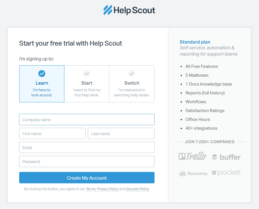
free trial
Why it Works
Overall, Help Scout still has a beautiful design. Their message and services seem pretty clear. They’re doing all the right stuff to address the basics.
Their blog is great. They have some fantastic resources with nice graphics. They have a lot of high-quality material overall. It’s super original with a clean layout. You can easily learn more about the team. They have a strong lead magnet with a CTA to download their tool kit.
What Makes it Unique
Help Scout once just offered helpdesk services. Today, they’ve expanded their offerings to include a research component and a data library.
Where it Could Be Better
I think some sort of diagram explaining how the site works would be helpful, as well as a before and after. Since there are multiple tools, Help Scout could afford to be clearer in its homepage copy. That lets you differentiate tools.

Help Scout might want to keep their Help desk software, made more human header floating with the user as they walk through the site. That might be beneficial.
They could also add more social proof to make their website more personal. If they take a similar route to Basecamp with more visuals and people’s faces, that could help. People find faces more engaging and trustworthy than images alone.
EXAMPLE 12 – DRIFT

Drift offers live-chatting on your website. They also have some other helpful tools. They have a pretty good blog that links to their homepage. We’re already customers of theirs, as I’ve mentioned on the blog recently.
Steps in Sales Funnel
- Traffic (blog, referrals, organic, affiliates)
- Homepage
The homepage is incredibly simple. The background is plain white. There are a few large images of real people. There’s a signup sheet right in the middle of the page. There’s another one at the bottom of the page.
3. Pricing Page

The pricing page is interactive. You can use a slider to add or remove more features.
Why it Works
Drift’s sales funnel is effective because of its easy, direct path to setup. They only ask for your email address to start using the service. You don’t necessarily have to add your credit card information. They mention that thousands of other companies use Drift (us included), and mention some of the bigger ones by name.
Once you sign up, you can use the service right away. The free version doesn’t include as much as the paid version, however, you can use it free forever.
What Makes it Unique
The fact that Drift offers its services for free is quite unique. As I mentioned, plenty of companies do free trials, but few offer totally free services. For some smaller companies, they might never need to pay for Drift. Others may try the free version and decide to pay for more features, moving further down the funnel.
Where it Could Be Better
There’s a signup box on their homepage, but it’s not clear if that’s the place to sign up. It’s just a form with a black background. There’s also no image near the signup form. They could focus on adding more visual cues.
EXAMPLE 13 – MINT

Mint.com is a business-to-consumer website. It’s all about downloading and keeping track of your financial data. It’s a free app, so they want to make it as easy as possible for people to get signed up and start benefiting immediately.
When Mint first launched it was a big deal to have to connect your bank account to an online company. Back then, people were very skeptical. Maybe not so much today.
The most basic part of their funnel is that you can sign up for free.
Once you’re using Mint, the way the site makes money is through credit card recommendations. Mint goes through your finances and matches you to a card. This is done in a win-win way, though. You’re signing up for the credit card, which makes the credit card company money. But you’re saving money through the site’s features and getting rewards.
You can find out more about the credit cards on your account under the recommendations section.
Once they have enough data and their system determines it’s the right time, Mint will actually email you a personalized recommendation for a credit card.
Steps in Sales Funnel
- Inbound Traffic (blogs, referrals, organic, affiliates)
- Homepage

Their CTA is always above the fold. There’s really not a lot going on here. It’s worth noting that they are frequently A/B testing. That means the design could change from the time we publish this post. There’s a “how it works” page that clearly explains the services.
Signup Page
Click on the orange button to sign up. It’s very clear. Signup is always free.
Why it Works
Today, Mint is more than just a personal finances manager. It also tracks your credit score (at no extra charge), lets you pay bills right from the app, and creates budgets.
It works because it’s simple. The CTA is clear. The design is trustworthy. In addition, the visibility of the signup button remains across all the pages, both at the bottom and the top of the landing pages. That’s a best practice. It also works because visually, they show you exactly what you’ll be getting when you sign up. There are screenshots of the application and not a lot of text. Mint is very benefits-focused.
What Makes it Unique
Mint appears to be targeting people based on location. For example, I’m located in the northeast. The background image is wintry with people dressed in warm clothing. If I was in Florida, it might be personalized differently. They might be doing geographical targeting with the design.
There’s also consistent branding. You always see the Mint logo and colors across the pages. Everything you need to know is above the fold or just a short scroll down the page.
Where it Could Be Better
It’s all coming together is a bit of an obscure headline. As a Mint user myself, I don’t think that phrase relates to the benefits of the service. I think When you’re on top of your money, life is good would be a much better headline. Their current headline is just an empty branding phrase.
Enjoying this indepth article? If so, you might like to grab a copy of my free download bonus, “The 11 Point Perfect Sales Funnel Checklist.”
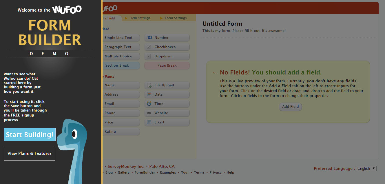
EXAMPLE 14 —WUFOO

Wufoo is not too heavy on the design. If anything, it feels a bit light. As a long-time customer, I can say that they have de-emphasized the dinosaur and cartoonish aspects. I think that has been a negative move in the sense that it’s sapped the personality from the site. It’s still there, but subtle.
Using the site is pretty simple and straightforward. What is their sales funnel like?
Steps in Sales Funnel
- Traffic (blogs, referrals, organic, affiliates)
- Homepage
As I’ve said, their homepage is very simple with few colors and illustrations. The CTA buttons are found three times on the homepage: first within the fold, then midway down the page, and then at the bottom.
3. Pricing Page
There are four pricing options: gratis (a service that’s always free), ad hoc with 10 forms and 500 entries, bona fide with unlimited forms and 3,000 entries, and carpe diem with unlimited forms and 15,000 entries.

4. Free Signup
There are two options: pro pricing and free signup. Signing up is as simple as possible. You just need to create a username and password. Once you get in and start using their tools, you’ll have to upgrade. The free account limits the number of forms you can use. When you hit that limit, you’re requested to upgrade. Otherwise your account won’t work.
Why it Works
It works because the copy is clear. There is some unique branding as far as the logo and subtle dinosaur elements. In their introductory video, they’re showing you exactly what the application looks like, as if in a demo.
The language in the copy is also informal and casual. There’s lots of social proof from top brands that everyone knows. You can even see more brands. They emphasize that their pricing is free at first. There’s no reason not to give them a try.
What Makes it Unique
They put a heavy focus on icons. You can actually click on them and get taken to an interactive demo. However, it’s hard to tell that they’re clickable. You can dive pretty deeply into the features through those icons.
They also put a heavy emphasis on signing up for free right away. They also do make it clear that with a free account, you are limited. If you want more, you will eventually have to sign up for the paid plan.
Where it Could Be Better
As I said above, Wufoo has a light design. They could maybe add to it more. Since they removed the dinosaur focus, it’s almost like Wufoo doesn’t know what it wants to be from a design perspective. The graphic in the demo video is inconsistent.
As a long-time customer, I actually appreciated a lot of their old design elements. They’ve since scaled these back. I really believe these baked in personality.
Also, on the pricing page, it’s unclear what the checkmarks mean. It’s safe to assume that these are the features offered and they extend across from another column. I mean I can intuit it, but can everyone? It may be easier and more clear to put checkmarks directly on the features in the plan.
EXAMPLE 15 —MAILCHIMP

MailChimp is a freemium email marketing tool. Similar to Wufoo, they offer a free plan (good through 2,000 contacts). A bit of background: MailChimp grew their business significantly when they decided to go freemium. How? At the bottom of every email, it would say something like Powered by MailChimp. Every customer email sent helped to spread the word. It created a kind of viral loop.
Steps in Sales Funnel
- Traffic (organic, direct from emails, blog, word of mouth)
- Homepage
Their homepage has an interesting graphic. It’s the first step of the sales funnel. A branding line similar to Mint.com’s, MailChimp’s slogan Being yourself makes all the difference really has nothing to do with the tool. That might be a good thing. It’s aspirational marketing not unlike Grasshopper above. It’s about identity, freedom, and self-expression — ideas that are bigger than a product.
It’s likely that this method converts better and is more persuasive. These companies are established, and through A/B testing are embracing these aspirational marketing ideas.
Similar to Mint, MailChimp has three sections on its homepage — features, pricing, and e-commerce — and not a lot of text. It’s simple.
3. Pricing/Features Page

On MailChimp’s pricing page, the focus is on getting you signed up for free, with an email, username, and password. They want to get you up and running and start using the product as soon as possible. They hope you will help them market themselves by using their products and spreading MailChimp further. Email marketing is often a one-too-many communication platform. The more you use it, the more likely you are to upgrade.
Their pricing page is interactive. You just add in the number of subscribers you have. You can go unlimited, too.
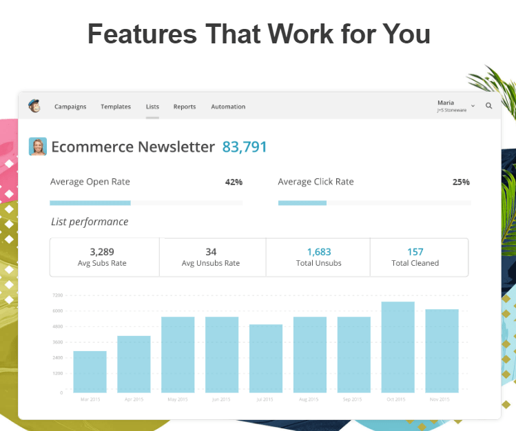
There are plenty of screenshots on their site so people know what the service looks like when used.. In a way, these are social proof because they show you how other people have used MailChimp’s service. You can imagine how you’d use it in the future. There are also plenty of logos, adding more to social proof.
Why it Works
One of MailChimp’s features that really works is advertising how many millions of people are using their service. That’s a great example of social proof on their terms.
What Makes it Unique
I like the interactive pricing. I think that is still a unique thing. You can put in how many subscribers you have and it will instantly quote you the exact price. The simplicity of the pricing is also good. It’s really based on how many email subscribers you have.
The aspirational marketing is really dominant on the homepage. I think that’s a very unique angle. They really don’t talk at all about sending emails. It’s more about getting you in to use the product. Once you hit those limits when using it, you’ll have incentive to upgrade.
Where it Could Be Better
I’m curious how much of a difference the aspirational marketing makes. MailChimp barely mentions the fact that email marketing with their services can grow your business. They don’t focus on results like getting more sales or leads.
It appears they’re just going super broad. They want everyone to use MailChimp, whether it’s personal or for business. They want as much viral spread as possible.
Continuous A/B testing is really key. If they don’t already, they should test having both a male and female on the homepage.
EXAMPLE 16 —MOZ

Moz’s site, which features headlines like “SEO simplified” and “rise in constantly evolving SERPS with the right tools, recommendations, and trusted data,” is a little jargon-heavy. Less advanced users might not immediately know what SERPs are. There’s a lot of text as well.
Steps in Sales Funnel
- Traffic (organic, direct from emails, blog, word of mouth)
- Homepage
The homepage segments its audience by calling them professional SEOs. They’re not afraid to go heavy on the copy. Their products break down into two audiences: ones who want a DIY solution (like a local business with more than one location), and marketers. People can self-segment.
They do have social proof on their homepage, but there’s a lot going on. They’re very resource-focused.
Features Page
There’s got to be a middle step based on how they have their funnel set up. You’re either going to be a marketer or you’re going to be a local business owner. The features page does have screenshots and social proof.
Pro Features Page

For paid members.
Pricing Page

If you sign up for a free trial, you have to input credit card information. You get a 30-day free trial, then you’re charged monthly.
Why it Works
Moz is great at using social proof. Their homepage is informative even if it is a little text-heavy.
What Makes it Unique
Again, they go heavy on the copy on the homepage. Moz does a great job incorporating social proof as they explain their top features. With the full name, picture, and company name of the user talking about the feature, their social proof is very legit. It’s believable.
Where it Could Be Better
As I mentioned, the homepage has a lot of jargon. The text can be reduced and simplified through A/B testing.
I’m surprised there’s no CTA button at the bottom of the pricing page or features page. I’ve found that not everyone notices the CTA button in the top corner, so having one that follows you down the page would be better.
It’s a little confusing. Is Pro the same as a regular account? Making that distinction about it being two different products (Moz Pro and Moz Local) would be helpful. Otherwise it’s a little complex and you have to keep track.
Having social proof at checkout would be good. Testimonials near the credit card entry field would help.
Moz should be testing whether requiring a billing address is going to help conversion rates, because marketers are pretty savvy. They’re typically heavy users of the Internet and know they’re getting a digital product. Why do they need the billing address? How much is that potentially hurting business?
EXAMPLE 17 —NETFLIX

Netflix changes its background image based on what movies and shows are being promoted. Their site is very simple. There’s a risk reversal right off the bat. You can cancel any time and not be locked into anything. You can try it free for a month. They’re not saying, “Hey, this is movies streaming online.” They’re relying on the power of their brand.
Steps in Sales Funnel
- Homepage
Their homepage explains their risk-free trial, stating that there’s no commitment and you can cancel anytime. The emphasis on risk reversal is very heavy. It makes sense. Netflix is a recurring charge. A lot of people are on a budget. Unlike businesses, which are used to recurring services, an individual doesn’t always look at it the same way.
They’re more worried about being locked in, and whether they could be spending that $9/month elsewhere. They’re more loss-averse, and Netflix is addressing that. That’s a big part of what is working with Netflix.
Their homepage is also very simple. There’s not a lot going on. There are just three little bits of copy. You know exactly what you’re getting with examples of shows and movies.
2. Pricing Page


You can scroll right down to pricing info. You can join for free for a month. By default, Netflix selects the Premium plan for you. You can downgrade if you want. The pricing is very clear.
It wasn’t immediately clear, though, that Netflix selected a plan for me. It’s smart to have a plan selected by default. They might do that on purpose to obscure that they’re selecting the most expensive plan.
3. Signup Page
4. Billing Information
They have Norton on here. Norton has been found to have the highest conversion rate. People trust it the most when checking out.
Why it Works
You have multiple payment options: gift card, credit card, and PayPal. All major credit cards are accepted. You can go back and edit information so you’re not locked in. There’s an emphasis on security. People are risk-averse, so this addresses that.
Netflix is simple. It’s very focused on the end consumer. They answer consumer questions in the least amount of text needed.
What Makes it Unique
Netflix can rely on the power of its brand. By now, everyone knows Netflix by name.
If you start an order, exit the site, and return to the homepage, you can click a button to finish your order. That’s a nice personalized touch. You can also contact them by phone. Not a lot of web-based companies share their phone number. This just builds trust even further.
Where it Could Be Better
I wonder if placing the continue button on the pricing page to the right instead of the left would make more sense. Part of me expects it on the other side.
There’s also a lack of continuity between the homepage and the pricing page. The homepage has a black background and the pricing and checkout pages have a white background. I wonder if that’s worth A/B testing.
Conclusion
Sometimes, when you’re stumped about why your sales funnel isn’t converting the optimal amount of customers, it helps to look at examples. We’ve revisited more than 10 companies that have strong sales funnels to see what changes they’ve made over the years. We’ve also added several brand new sales funnel examples and we plan to add more in the future.
To review:
- The stages of a sales funnel differ from company to company. Some have only two steps, while others have upwards of five. Still, others even have mini funnels splitting off from the core funnel like branches from the trunk of a tree.
- Never be afraid to make a big design move as you develop your own funnel, but don’t totally alienate your customers. Leave something familiar behind, be it a mascot or color scheme.
- A/B test often when implementing a new sales funnel. User testing videos of people using your website can also provide more immediate insight on where the leaks are.
- Go light on the text on your homepage. Clarity of what you are offering is key.
- Make the customer feel secure as they’re checking out. Your checkout page shouldn’t differ too much from the design scheme on the rest of the site. People should fee like they are on the same website.
Which of these sales funnels examples was most useful to you? Did these inspire you to revisit your own sales funnel? Let me know in the comments.
Keep Hustlin’, Stay Focused,
This article was originally published at Autogrow.co, by author Matt Ackerson. Original article >>
Recent Comments